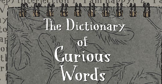
An Introduction to Our Current Project: The Dictionary of Curious Words
Looking through fresh eyes from cover to first page
New newsletter opportunities
It was rather disappointing when I found out that Twitter was closing down Revue, but this has given me some surprising opportunities.
One of the things I have most appreciated about moving our newsletter from Revue to Substack has been the opportunity to look at my current project with fresh eyes. It is not always easy to remember that not everyone is a longtime fan.
For both a newsletter and a book on the shelf of a library or bookstore, the challenge is the same: making a good first impression. (This is exactly what my chickens do whenever someone new meets them, but chickens aren’t allowed in most libraries or bookstores.)
With me, and I think with most other people, this is done by looking at the front cover, the back cover, and the first page of the first chapter.
Front cover
Why we think our cover will work: The cover emphasizes “Things are not always what they seem to be.” This is actually an exciting fiction book but it is disguised as a dull non-fiction reference book. (No one reads dictionaries, do they?)
The genre is magical realism which paints a realistic view of the world and magical elements are treated as everyday occurrences. It is written for middle grade readers and older readers as well.
The cover ties in to the actual story. The main character, a teenage boy named Nate, begins making notes and drawings in a long and narrow reporter’s style notebook (featured on the front cover). He is interested in recording what his baby chicks say, and he will eventually learn to speak the language of chickens. In order to give his notebook a realistic look that will be accepted by his aunt and uncle, he gives it a title that sounds seriously dull and perhaps even educational.
For most teenagers, “educational” likely means “boring,” but for adults, it means “beneficial” and “worthwhile.” By giving his notebook the title The Dictionary of Curious Words, Nate hopes to ensure the safety of his secret: he is able to talk with his backyard chickens. The theme of “things are not always as they seem” appears throughout the series in various forms to add mystery and suspense.
This visual feel will also be carried through to interior pages which begin each major section of the novel. We will take a look at them in a moment.
Why we think our cover may not work: It may seem out of place among other books for middle grade and older readers since it does not use bright colors or have a contemporary feel. But those likely would not fit with the concept of this book
Back cover with concept and conflict
The back cover includes information about the concept and conflict.
Why we think our concept will work: A novel’s concept starts with asking “What if…?” The creation of The Dictionary of Curious Words began by asking the question “What if there was a world of birds that existed alongside the world of people?” It developed further by asking “What if there were places where the world of birds intersected the world of people?” And with that, I had to ask, “What if such a place existed in someone’s own backyard garden and they recorded it?”
Why we think our concept may not work: This is a world built with ordinary chickens, everyday songbirds, and common things found in a backyard garden. It is not built in a magical kingdom with wizards and warriors or a faraway planet with aliens and monsters. Will potential readers be willing to take a risk?
Why we think our conflict will work: The conflict in The Dictionary of Curious Words is not between birds and people. (Alfred Hitchcock already did that in his 1963 classic film, The Birds.) Instead, the conflict is between Love and The Absence Of Love. It begins by showing up on the first page of the first chapter shown below.
Why we think our conflict might not work: Actually this is something we feel will work. What is scarier than The Absence Of Love which would mean not loving and not being loved?
The first page of the first chapter
While many chapter titles will often be accompanied by “From Nate’s Journal,” others like the one above will indicate “As recorded by the Pages of The Living Library.” This change in point of view allows the readers to encounter information that Nate may not know or which Nate might prefer not to record.
There is no “info dump” about The Living Library. (That would take its own book!) Readers will discover the secrets of The Living Library for themselves right along with Nate and Gracie.
Additional pages to create a feeling of immersion
The notebook on the front cover continues into the book itself with illustrated pages like the ones above which are intended to be reproductions of Nate’s notebooks. The font selected was hand drawn with a Japanese brush pen. To me, it expresses how Nate would have carefully done the lettering in his notebook to give it the impression of text printed on a letterpress. He would have wanted everything to be as real as possible so that his notebooks would be taken seriously. The illustrations appear as though they were done with a brush pen as well and then filled in with semi-opaque color.
We would love to hear what you think. All comments and suggestions are appreciated because we want to create the best book possible!


Without love we would not be. Can't think of a more important theme for readers young or old.
I love the look and the whole concept. The notebook style and illustrations all add to the feel. There is something very special here.